The context
We are constantly bombarded with political clutter from various forms of media. It’s hard to find the truth about what someone has said. Politicians seem so busy and so far out of reach that the general public aren’t getting their questions answered. That’s where rep’d comes in.
The process
User Flows
I was approached by two brothers who had the brilliant idea of setting up a platform for voters to put questions to and hear answers from politicians running for office. Each politician would set up their own rep’d URL and share their page with voters.
WIREFRAMES
These lo-fi wireframes were my first attempt and served the purpose of getting the conversation started. Based on my interviews with the stakeholders I confirmed that the questions and answers held the same position on the hierarchy of information - they were equally important. I also learned that they didn’t expect a modal to appear when they clicked on a video. They asked why they couldn’t just view the video on the main page.
Desktop
The Result
The video player was promoted to center stage!
I had the idea of putting all of the thumbnails down the right side of the screen, but that created a problem for the user. With the main video player at the top, the user would be forced to scroll down, only to jump back up to the top to watch the video. Instead, I incorporated a carousel so voters could watch and browse at the same time.
The questions were reformatted as well so show the photo and first name of the questioner so our politicians can answer them directly, by name.
Questions questions…
It didn’t make sense for a voter to leave the area in order to add questions to the list, so I incorporated a modal to make it easier for them to ask a question and carry on from where they left off.
And there’s more
Not only can voters ask and receive answers to their questions, but they can also volunteer and/or donate to the candidate’s campaign and help them thrive.
Mobile
asking, out of pocket
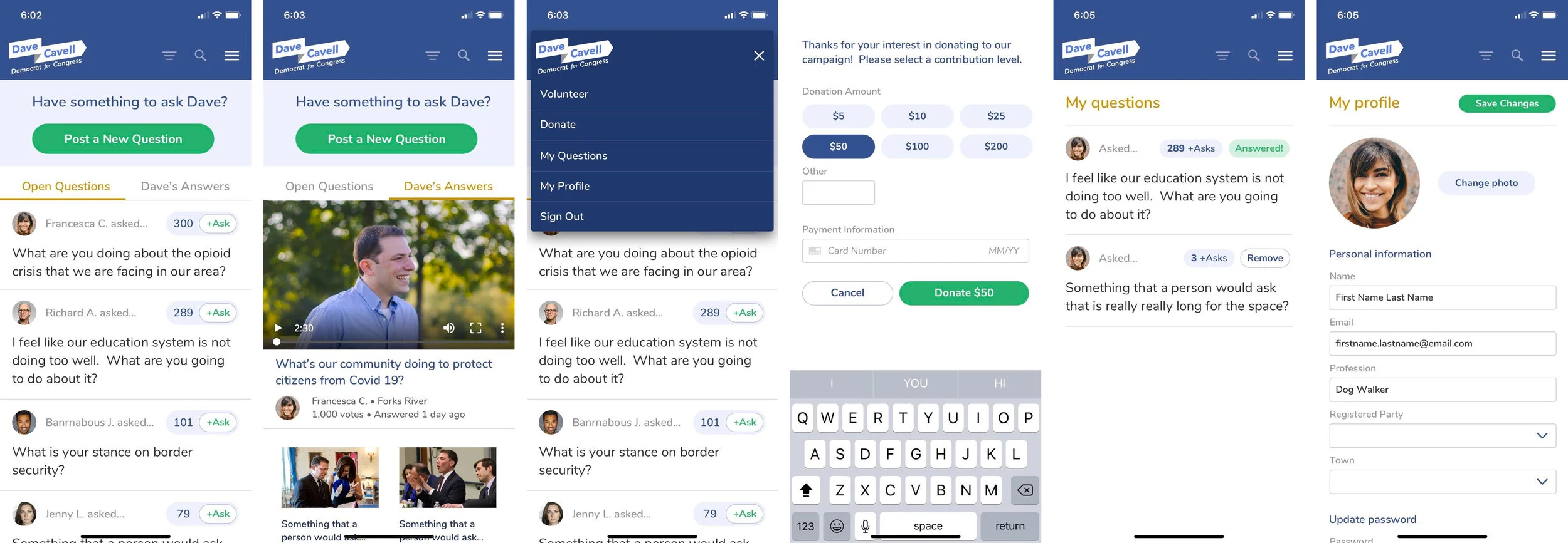
Making sure the site is responsive is a must for any platform. Because we had a split view on the web, it only made sense to split the view into tabs for mobile devices. Voters would still have all of the same functionality as they do on their computers, right in the palm of their hands.
Branding
lookin’ good
To begin the conversation I provide the three stacked concepts. Because rep’d is a tech-based company, they gravitated more towards the last option. I took the feedback they gave me and created the final text-based brand. However, something was missing - an iconic mark. So I crafted the two options, one with the top of the white house (because, hello… patriotic much?) and the second is a ballot box inside a play button. They opted to run with the White House icon.
The brand continues
Now that we had a logo to work from, we needed a website to go with it. I used Nunito font for the site because it is closely related to the brand. I made the call to action prominent and pop in a patriotic blue. Before you even move beyond the fold, the top of a mobile view is shown so that voters would be informed that this is something they can easily access on their mobile devices. I was also careful to utilize an appropriate amount of white space so voters wouldn’t have to deal with cognitive load.
Beyond the fold
As a viewer scrolls down the page, they can see at a high level, information about what voters can do.
And beyond that
The voters can also see what candidates are able to do and how they can access information via mobile as well.
the Conclusion
There are many routes that this project can go in. There are plenty of things that can still be done, updated, and/or fixed that would take it to the next level. The biggest stand out for me is, this was a hefty project to complete in only a week.


